
Stake attention in this memory
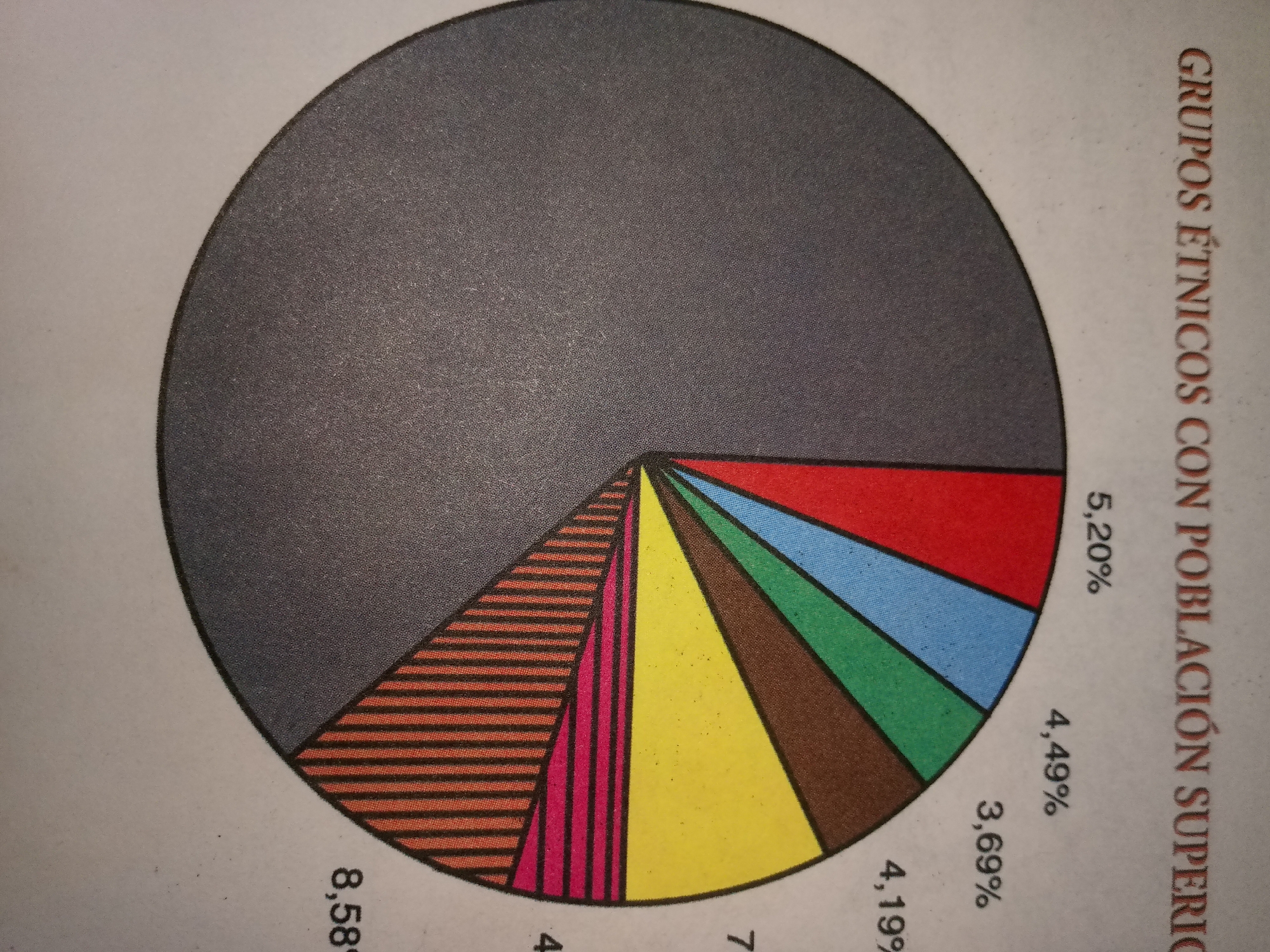
The image is a pie chart with several slices, each representing a different percentage. The title of the chart is "GRUPOS ÉTNICOS CON POBLACIÓN SUPERIOR" which translates to "ETHNIC GROUPS WITH SUPERIOR POPULATION". The percentages shown on the chart are: 5.20%, 4.49%, 3.69%, 4.19%, 8.58%, and several others that are not fully legible or are represented by patterned slices. The slices are colored and patterned in various ways, including solid colors like gray, red, light blue, green, brown, and yellow, as well as striped orange and solid pink patterns. The chart is positioned on a light-colored background, possibly paper, with some text visible on the right side. The image does not depict any scene in the city of Guayacán, Venezuela, or any real-world environment. It is purely a graphical representation of data.
Loading AttnAds…
No transactions found